.png)
.png)


Premium: Compare Groups
The Premium Compare Groups dashboard allows you to compare performance between two custom groups of store locations. This report is ideal for evaluating how different sets of stores perform against each other across multiple key metrics.
With this dashboard, you can group your stores into two segments (Group A and Group B) and analyze how each group performs side by side. This is especially useful for:
- Comparing regions (e.g., north vs. south locations)
- Evaluating newly opened stores vs. established stores
- Measuring performance across different store formats or strategies
These metrics allow you to understand both top-line performance and operational efficiency across your selected groups.
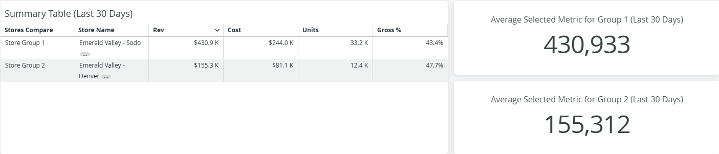
The first three tiles at the top of the dashboard provide a quick 1:1 comparison between your two store groups. These tiles summarize performance at a high level, helping you immediately spot differences between the groups.
To the right of the summary tile, you’ll find average metric tiles that are controlled by the Metric Choice filter at the top of the page. These tiles allow you to toggle between different performance metrics, such as:
- Revenue
- Cost
- Average Item Price
All tiles in this section are based on the last 30 days, giving you a recent and consistent comparison window.
Store Groups Through Time
This graph displays revenue over the last 12 complete months.
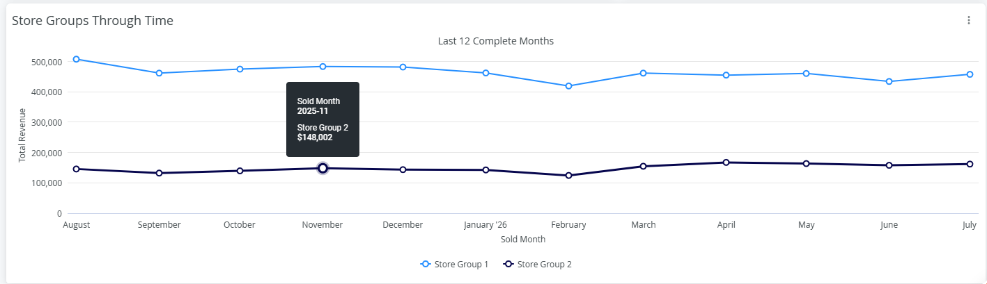
- Each line represents a store group
- Hover over any data point to view the revenue for that month
Use this visualization to:
- Track trends and performance changes over time
- Compare growth patterns between groups
- Identify spikes or dips in sales activity
Store Groupings % of Sales
This table shows how sales are distributed across categories, brands, or other dimensions for each store group.
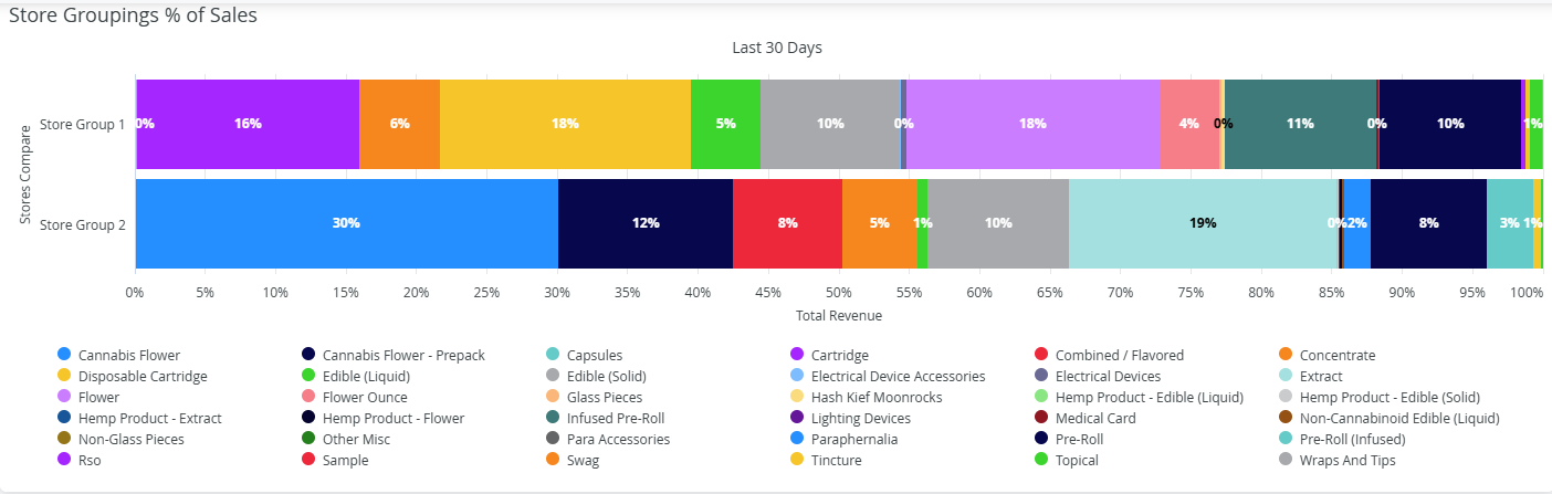
- The data in this table is driven by the “Slice Data By” filter
- Each section represents a portion of total sales
Hover over any section to view:
- Total revenue
- Percent contribution to overall sales
This view helps you understand what is driving sales within each group and how product mix differs between them.
Average Item Price Comparison
This data table compares the average item price between the two store groups. This tile is also controlled by the “Slice Data By” filter**.**
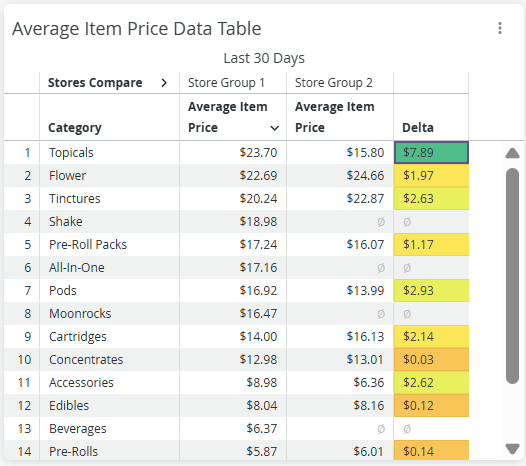
If the stores used in your analysis do not have like categories, brands, vendor you may see null values here. Since there is not an exact match at each location it is not possible to compare.
For example if one location uses the category “Extracts” and the other uses “Concentrates” though they are they same products they do not match.
Pricing and Discounting by Store Groupings
This visualization provides a detailed look at pricing and discount behavior across your store groups.
- Each bubble represents a data point within the selected dimension
- Hover over a bubble to view:
- Average item price
- Discount percentage
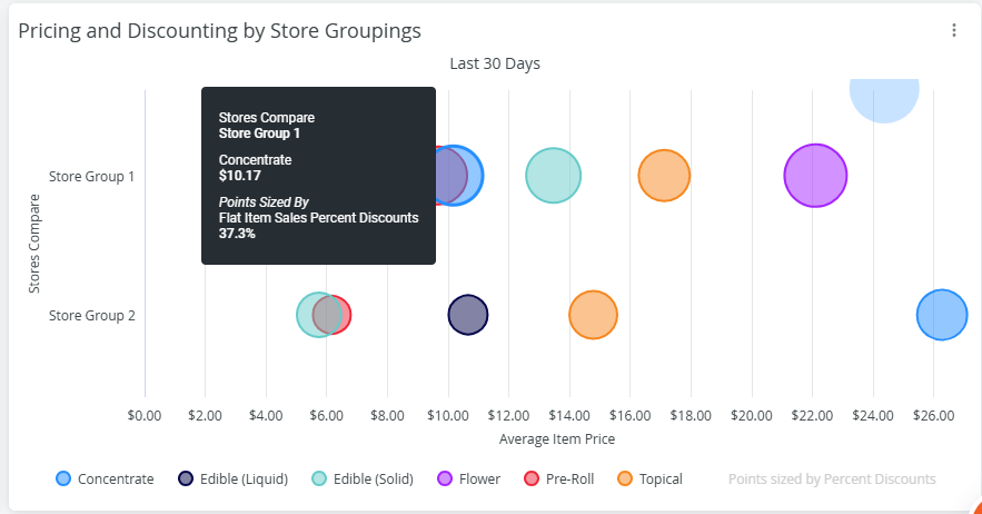
The dots are sized by the percent discount given. The larger the dot the bigger the discount given.
Because this view can display a large amount of data, it may appear dense. To refine your analysis: Use the filters at the top of the page to narrow your dataset. Focus on specific categories, brands, or vendors for clearer insights.
You can also click the three-dot menu in this (and any other table on the report) to download the underlying data for further analysis.
The Premium Compare Groups dashboard provides a flexible way to benchmark store performance by grouping locations and analyzing them across multiple metrics. By leveraging this tool, you can make more informed decisions based on clear, side-by-side comparisons.


