.png)
.png)


Store Compare Overview
This dashboard provides an overall impression of how each of your stores perform comparing them to each other.
This report will help compare metrics across ALL stores rather than just seeing data store by store. You can easily see which store has been growing and which store is struggling across a variety of metrics
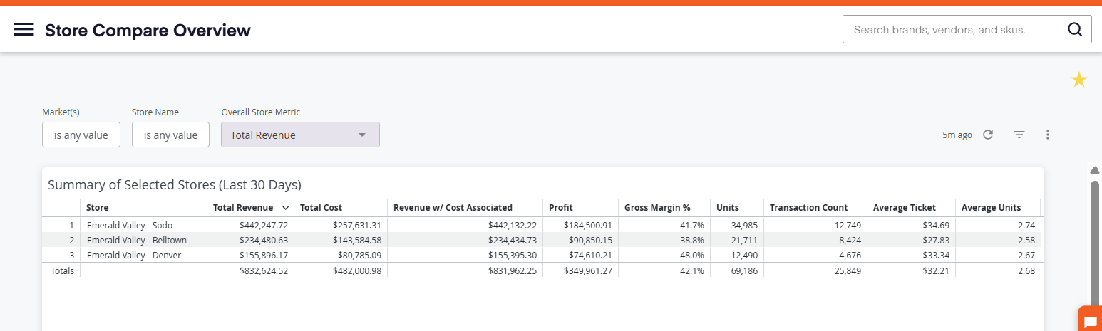
Summary of Selected Stores
The Summary of Selected Stores tile displays a breakdown of each store’s core performance metrics, including:
- Total Revenue
- Cost
- Revenue Associated with Cost
- Profit
- Gross Margin (%)
- Units Sold
- Transaction Count
- Average Ticket
- Average Units per Ticket
This section offers a quick, side-by-side comparison of store performance.
Selected Metric Trends
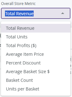
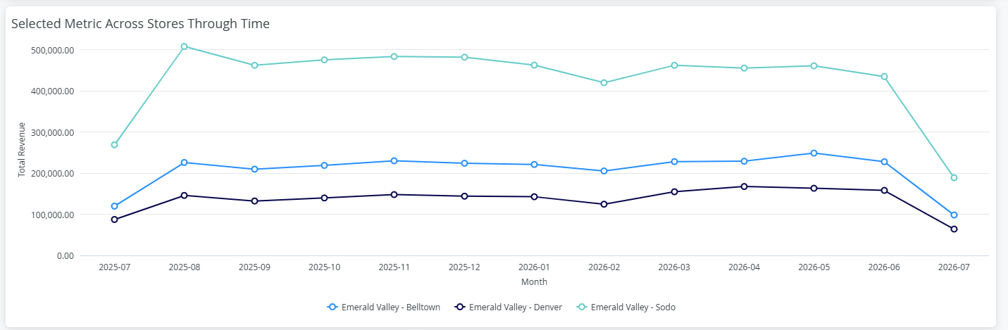
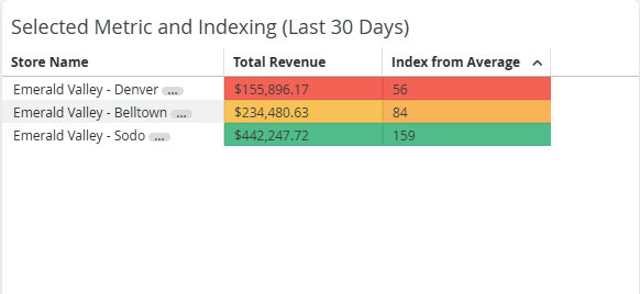
Below the summary, you’ll find two tables are driven by the Overall Store Metric Filter located at the top of the page. You can adjust this filter to analyze different performance indicators.
Selected Metric Across Stores Through Time
Selected Metric and Indexing for the Last 30 Days
Category Revenue Mix
The Category Revenue Mix table shows revenue distribution by category for the last 30 days.
To simplify the view when working with many categories, you can customize the display:
Using the category list on the right-hand side you can click on any category name to remove it from the visual. Simply click again to restore.
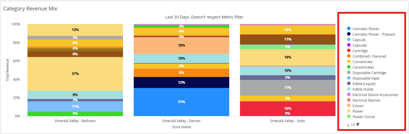
This feature allows you to focus on the categories most relevant to your analysis.
By combining these sections, the Store Compare Overview Report enables you to efficiently compare store performance, monitor trends, and gain actionable insights across your business.


